

Deal app - Design System
See Documentation
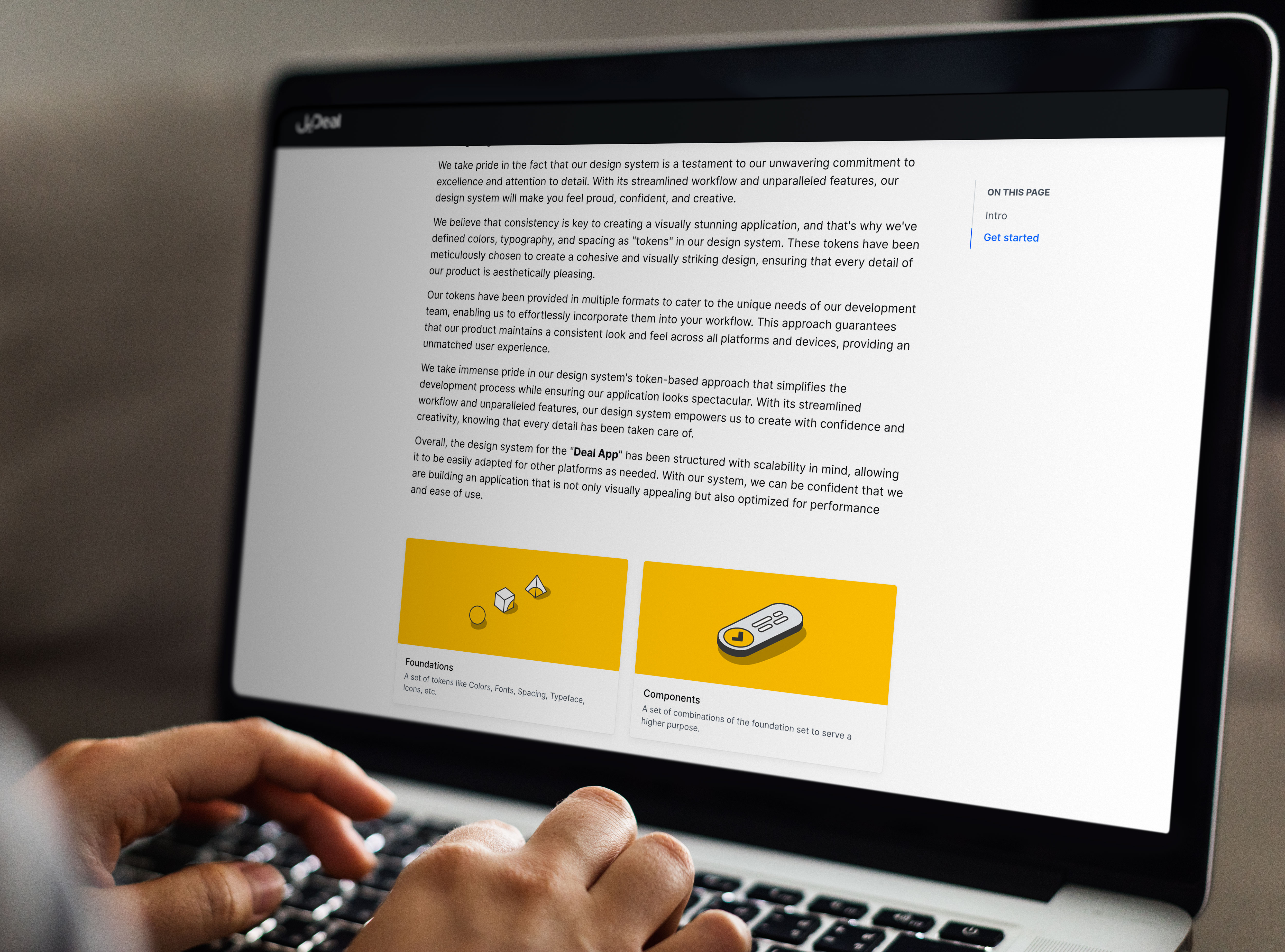
Design
Documentation
Design System
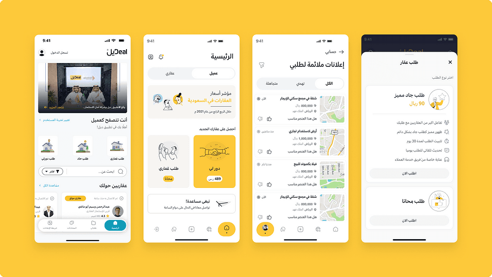
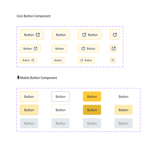
Mobile
Web
Tools & Methods:
Atomic Design
Figma
Notion
Supernova
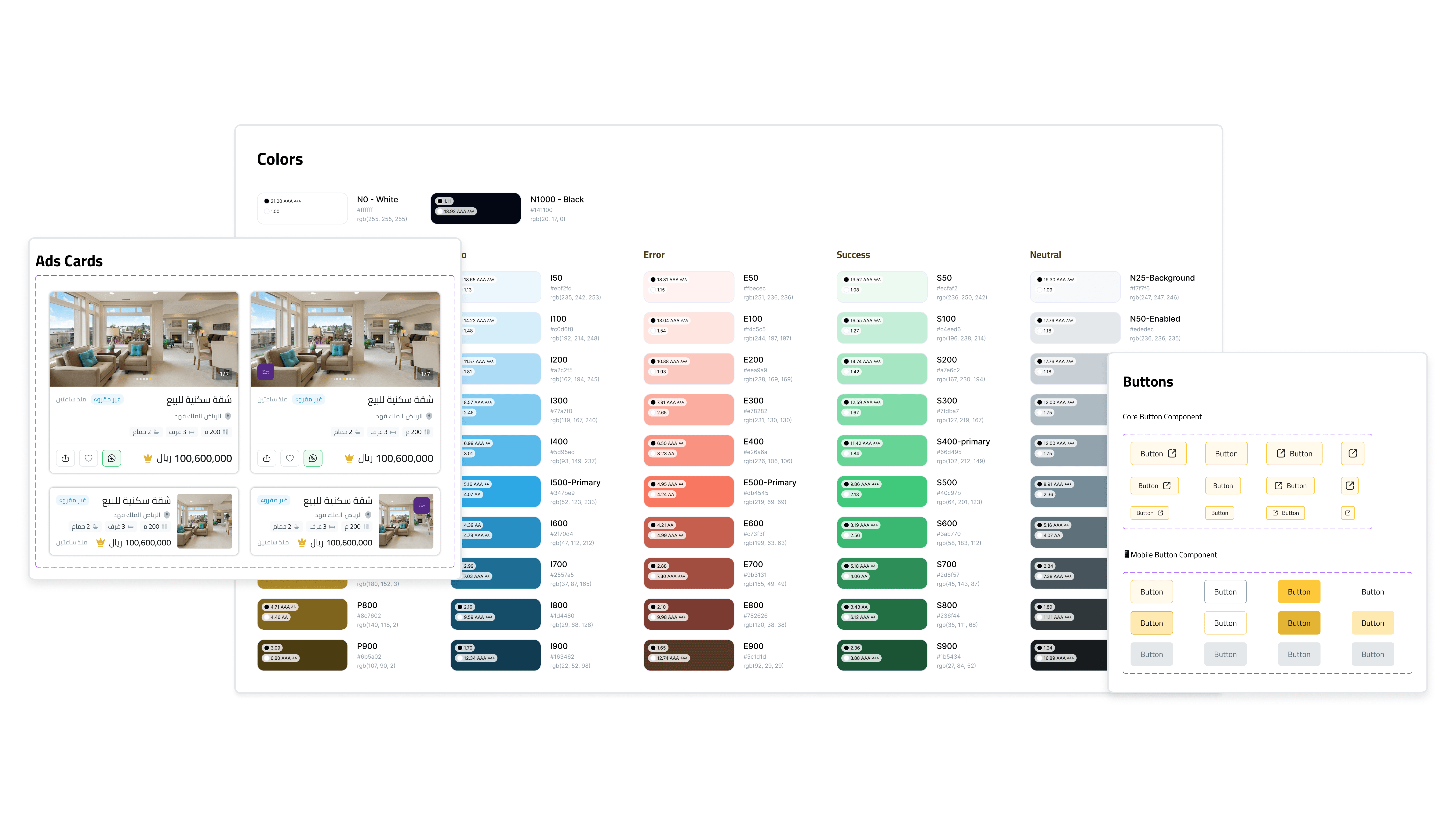
The project entailed the creation of an intricate design system for a digital product, which encompassed a detailed style guide and integrated component libraries. This system was carefully crafted to guarantee uniformity and coherence across various platforms. We conducted regular and thorough design reviews, focusing on assessing modifications from a multi-platform standpoint. These reviews were crucial in identifying potential inconsistencies and ensuring alignment with the overarching design principles. The primary objective of this initiative was to establish a streamlined and efficient design process, while simultaneously delivering a seamless and intuitive user experience. By prioritizing both consistency in design elements and adaptability across different platforms, the project aimed to enhance both the aesthetic and functional aspects of the digital product.
What have we done to get this design system out of the way without stopping working on product improvement?
Challenges Faced
1- The backlog of product features waiting to be designed.
2- Moving all designs from Adobe XD to Figma.
3- There is an absence of a comprehensive style guide.
4- Different methodologies when it came to designing.
5- Finding a new design direction for the app that meets the intended audience's needs, aligns with the brand identity and values, and supports the app's goals and objectives.
6- Study and research how to facilitate coding the design system while preserving the appearance and diversity we have achieved and staying within the direction of the front-end team as much as possible.
Strengths
1- Analyze user data and conduct user research to identify the target user persona.
2- Brainstorming different design schools to find a new design direction.
3- Creating a comprehensive style guide that meets the company's needs.
4- Assigning a task to a team of designers and developers to create a unified design process that works for everyone.
5- Conducting regular design reviews with representatives from each platform to ensure that changes or updates to the design system are evaluated from a cross-platform perspective.
6- Creating templates to help the design team keep updated with each other and to fasten their design process without looking back on old designs.
Steps Taken
After finalizing the Figma files, interaction templates, and graphics, and before integrating them in design screens, we needed to present our design system to other company divisions. The design system included Atoms and components in a single file, an icon library in a separate file that we could freely share with the graphic design and marketing teams, and design templates within each platform design file to make it easy for any squad to use, edit, and develop.
Handing off, and more
Handing off the design system is a recurring and continuing job with its own set of methodologies; after introducing the entire package, we had to figure out the best way to hand off each kind.
For atoms and components, we used Supernova.io because it is the most dynamic way of linking figma components with their documentation and a Github/Gitlab repo link that sends a notification in the event of an update from the design system team (if automatic updates are enabled) with features that assist some frameworks in converting these atoms and components into code.
We exported Tokens using Supernova in the initial step of designing our design system, then we began coding each component one by one as it became important to the current sprint processes.
Icon libraries were changed to icon fonts to make updating and altering easier without requiring the development team to focus on a process that could be completed without their involvement.
Templates were designed to allow the design team to maintain updated with each other and to speed their design process without looking back on outdated designs.
For example, instead of developing each card individually, we create the template once and then apply it to the six screens. So we don't have to refer back to them every time we need to change or add a new feature.
Documenting Design system
Every component and change had to be properly documented so that everyone on the team and future newcomers could discover the relevant documents to learn about the history of each item.
As an example of this strategy, we had four primary points in each component that addressed every aspect.
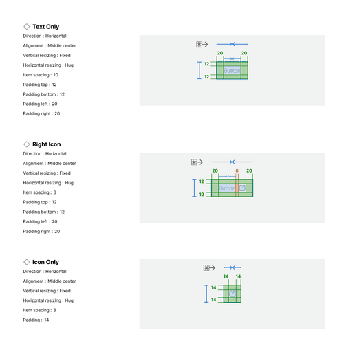
Anatomy: to explain each individual constituent within this component.
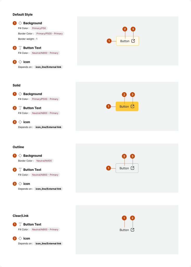
Properties: to explain Variants, States, and back changes relevant to it
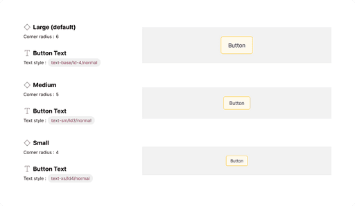
Explaining the size for this component
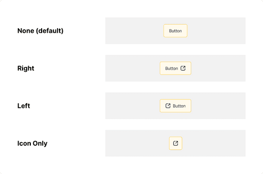
Explaining the Icon placing that we use
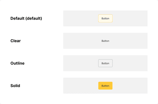
Style variants used in our design system
Layout & Spacing: covers padding, alignment, and vertical & horizontal sizing.
After these 3 main points, we had another automated area with the help of Supernova that display release notes for every component individually to help us at the product team know the history of these component changes and to help the tech team if something changed and where the changes are.
Preparing the design system for multi-platform support
Developing a design framework that allows multi-platform integration is critical to ensuring a uniform and seamless user experience. Companies can manage consistency and customisation by building two tiers of components: basic and platform-specific. Cross-platform design reviews, detailed documentation, and shared component libraries make it possible to retain consistency across platforms.
Embracing an iterative process with feedback loops guarantees that the design system is adaptable and continuously improves.
Understanding Multi-Platform Design Challenges
Designing for many platforms necessitates considering various screen sizes, interaction patterns, and technical constraints. If not addressed effectively, these difficulties might result in inconsistencies and disconnected user experiences. Creating a fluid design system that adapts to numerous platforms addresses these difficulties, resulting in a cohesive and harmonious user experience.
Defining Design System Levels
To construct a design system that works across different platforms, it is critical to define component levels that allow for flexibility and customization while preserving consistency. Our organization took a two-tiered approach: basic components and platform specialized components.
1- Foundational Components: These components constitute the heart of the design system and are platform independent. They include core features like typeface, colors, space, and icons that are consistent across all devices. Foundational components serve as the building blocks for higher-level components, ensuring a consistent user experience.
2- Platform-Specific Components: Platform-specific components address the platform's unique requirements and limits, whereas foundational components provide consistency. These components include navigation menus, input fields, buttons, and other interface elements that are specific to the platform's design rules and interaction patterns. Platform-specific components enable for customisation without sacrificing consistency, making consumers feel at ease on their preferred platforms.
Ensuring Cross-Platform Consistency
While platform-specific components provide more flexibility, maintaining consistency across platforms is crucial. To do this, we developed rules and practices to encourage collaboration and ensure that updates are deployed consistently across all platforms. Key strategies include:
1- Cross-Platform Design Reviews: Holding regular design reviews with representatives from each platform ensures that modifications or improvements to the design system are considered from a cross-platform standpoint. This collaborative method facilitates the detection of potential conflicts or inconsistencies and creates a shared understanding of design decisions.
2- Shared Component Libraries: Using shared component libraries, such as design system software or plugins, designers and developers from various platforms can access and implement components smoothly. These libraries simplify the integration process and ensure that updates are applied consistently across all platforms.consistently apply updates
Iterative Improvement and Feedback Loops
A design system is a living thing that must be constantly evaluated and improved.
Regular feedback loops between designers, developers, and end users are critical for finding areas for improvement. By actively soliciting feedback and iteratively updating the design system, we ensure that it remains adaptive and successful in meeting the needs of many platforms.